
Eduard/ is a contemporary tea label founded in Berlin in 2025 by tea sommelier Eduardo Molina. Every season, they release a curated collection of teas from a single tea-growing region. Each collection is a bridge into that region and an invitation to discover its terroir, people, and stories.
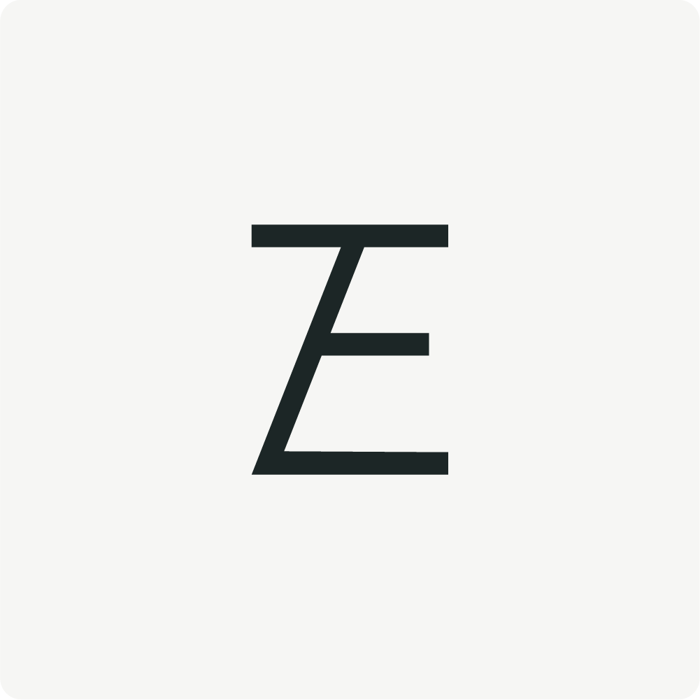
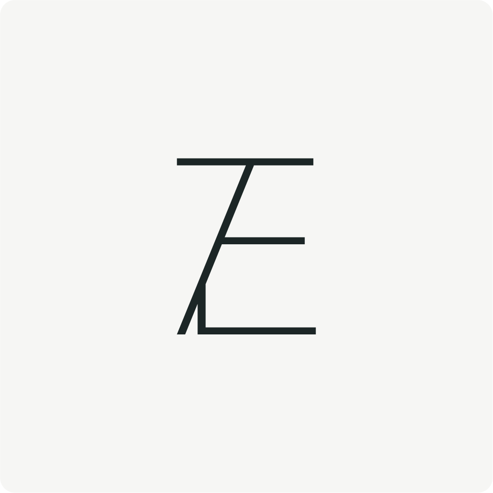
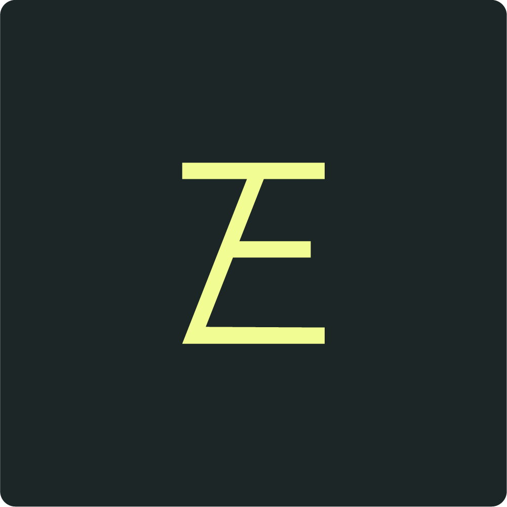
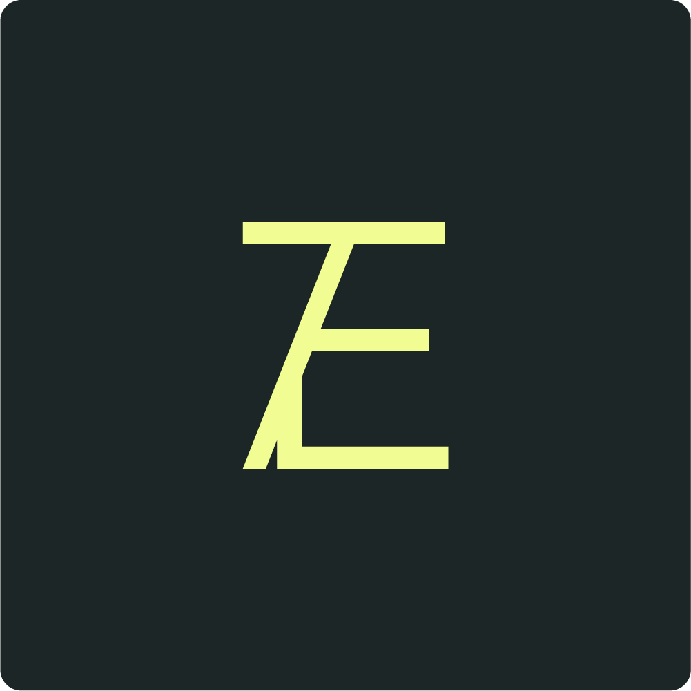
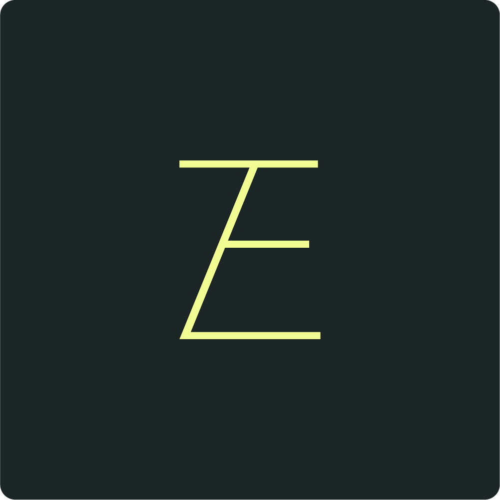
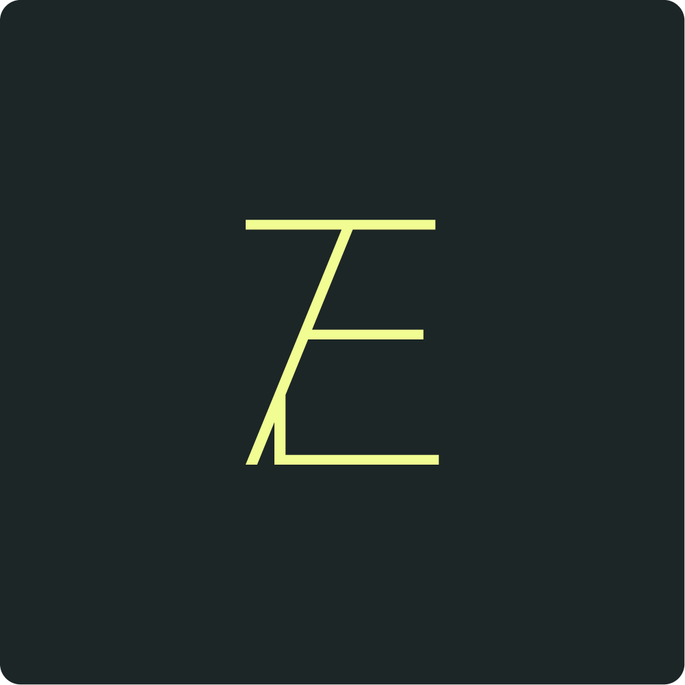
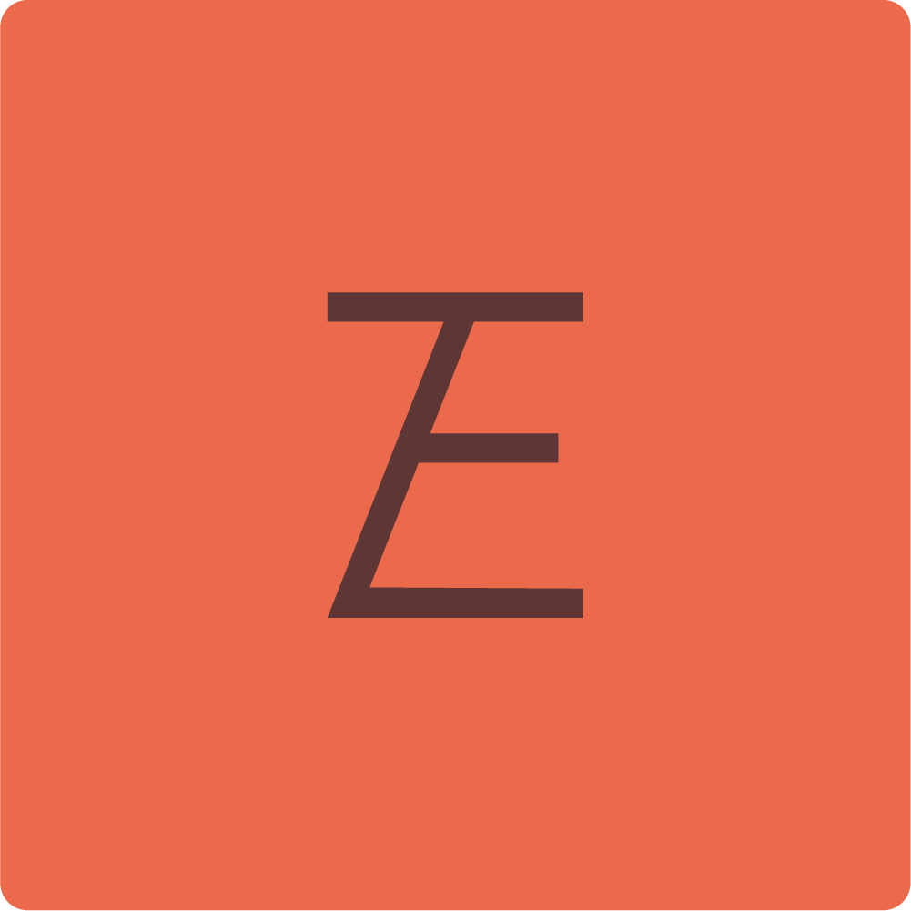
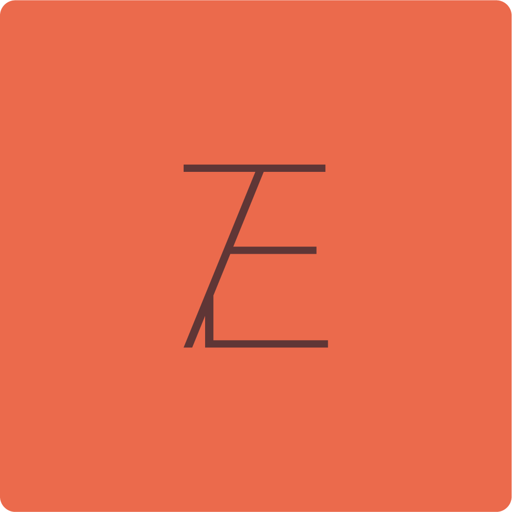
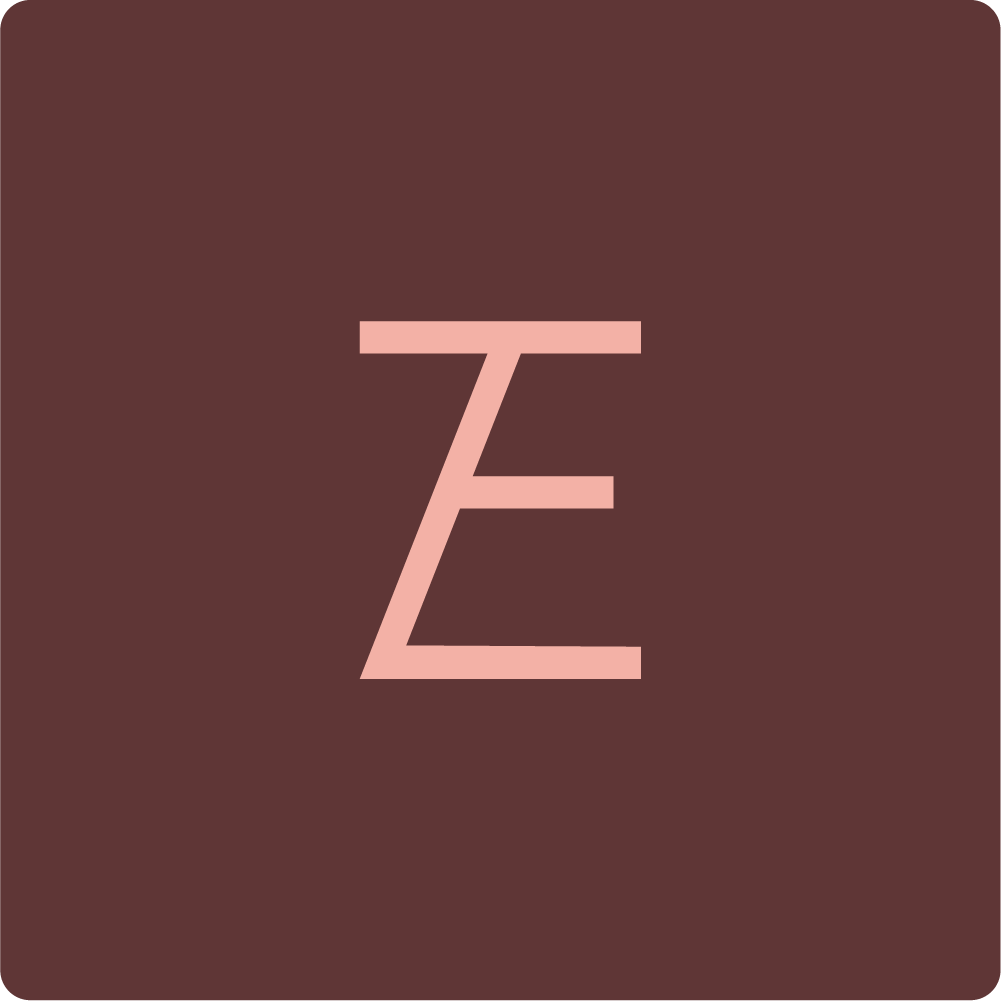
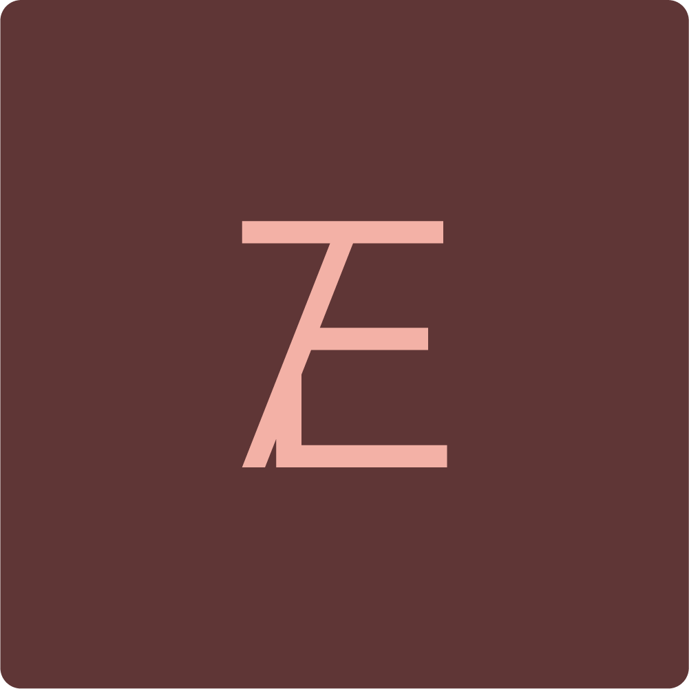
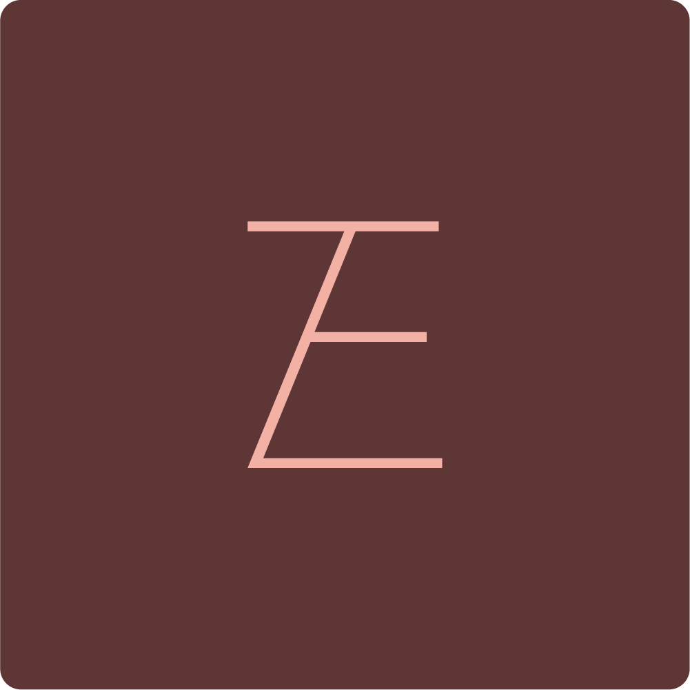
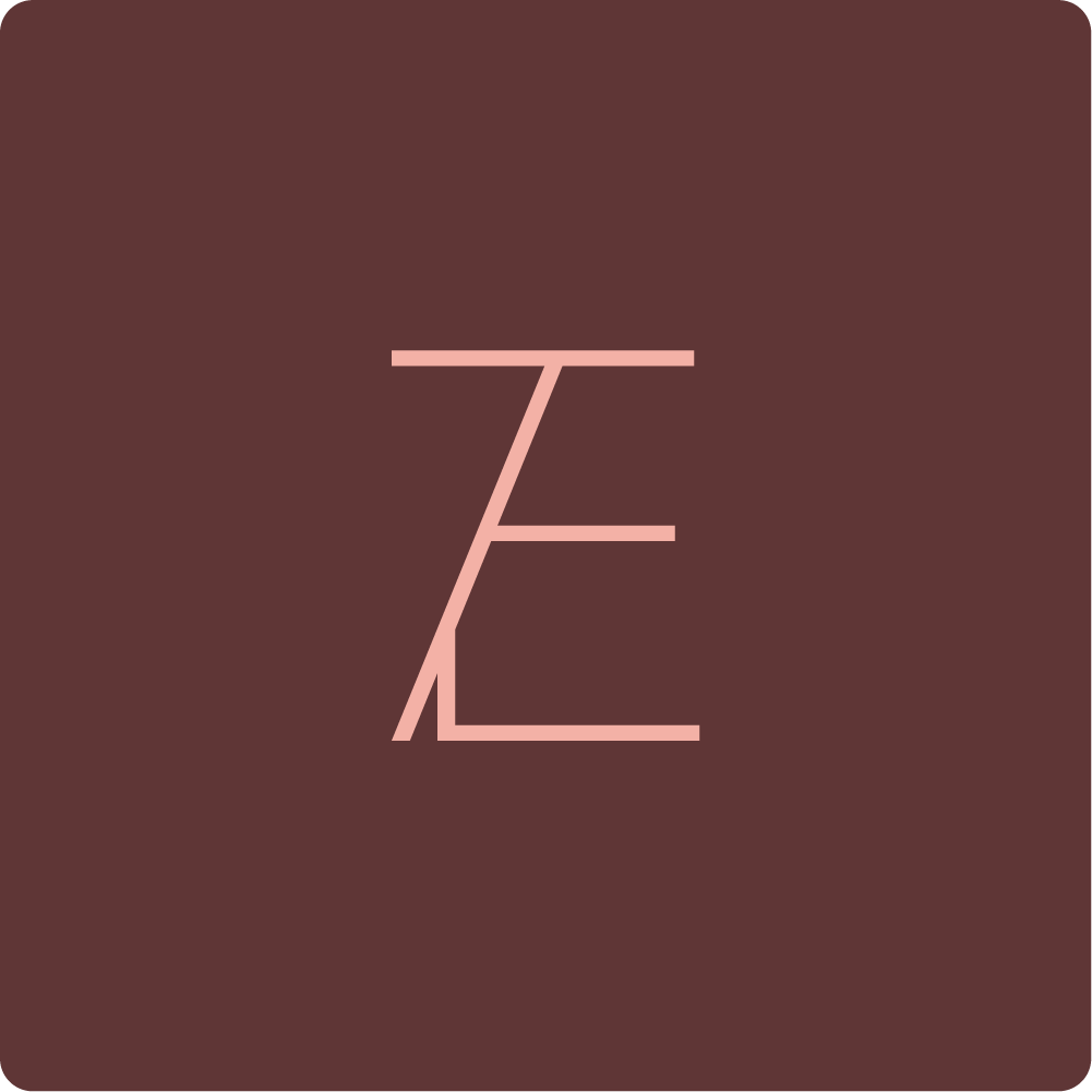
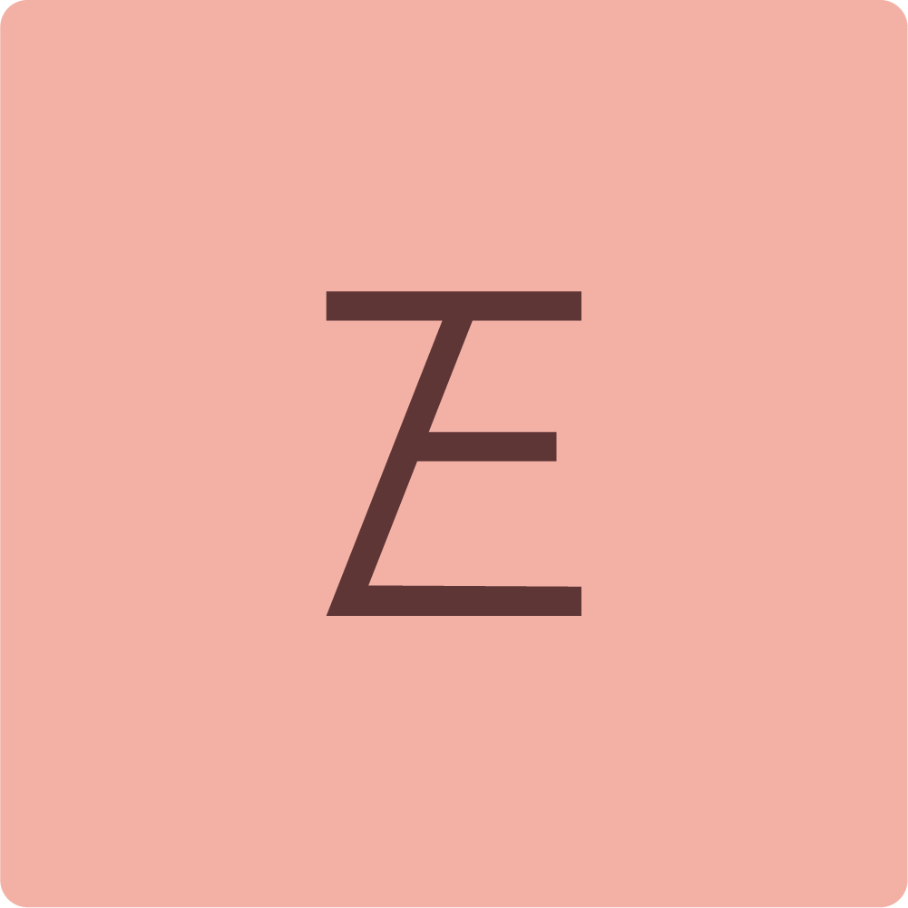
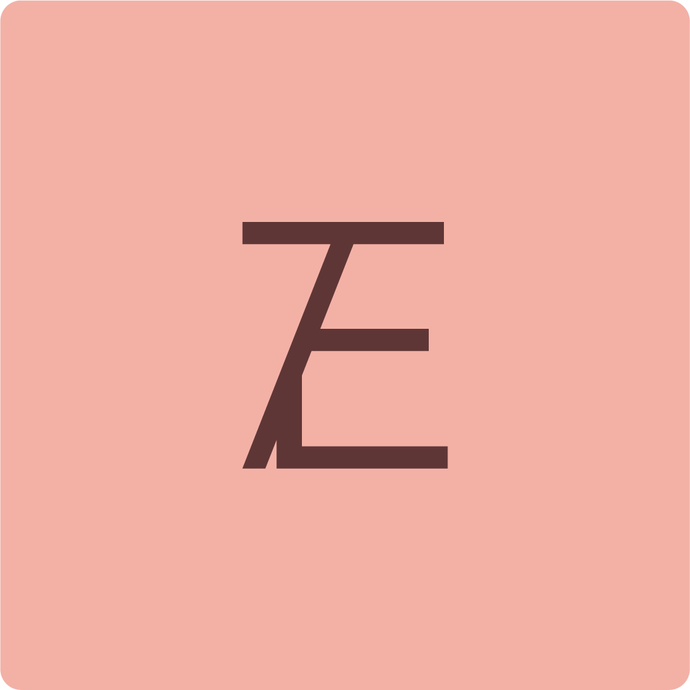
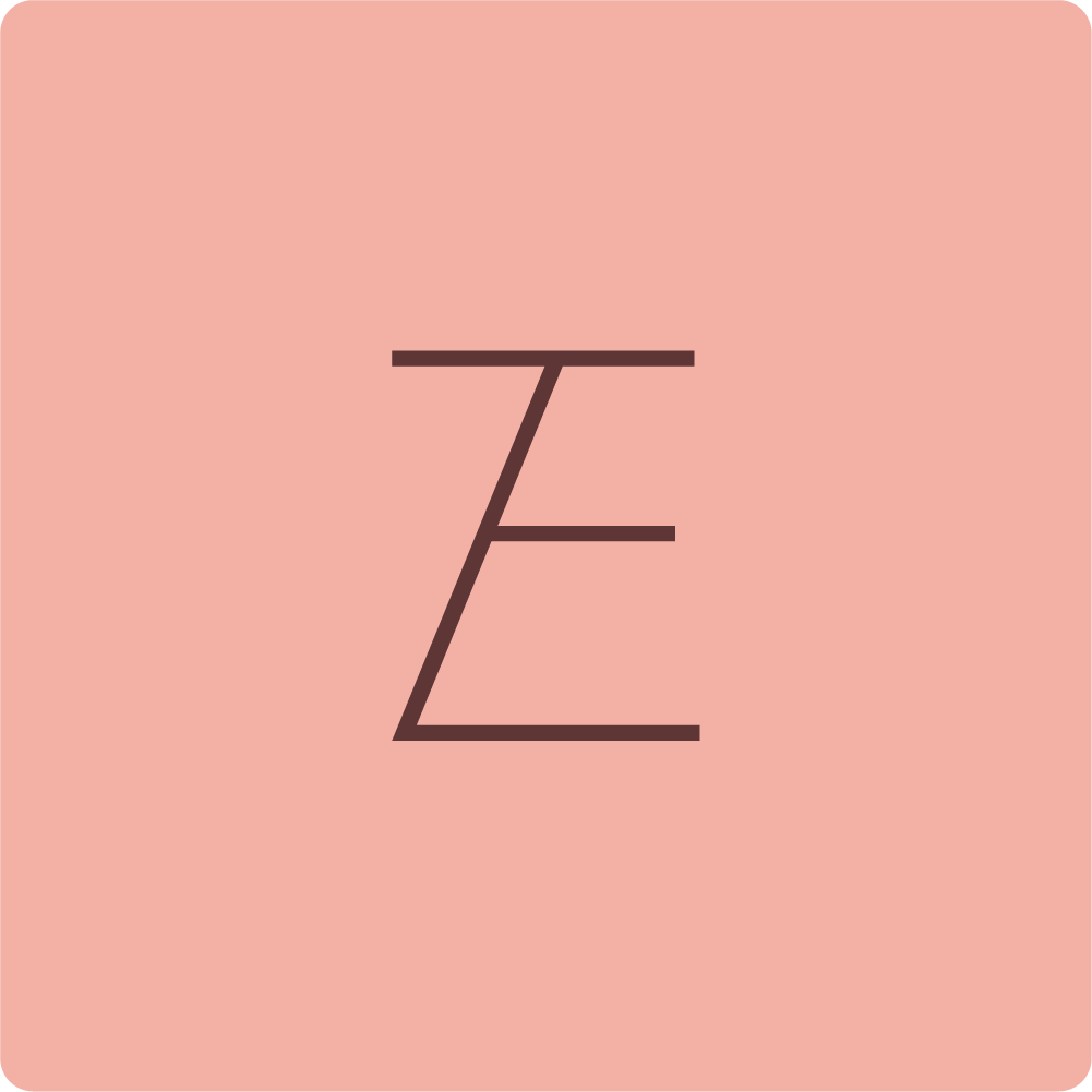
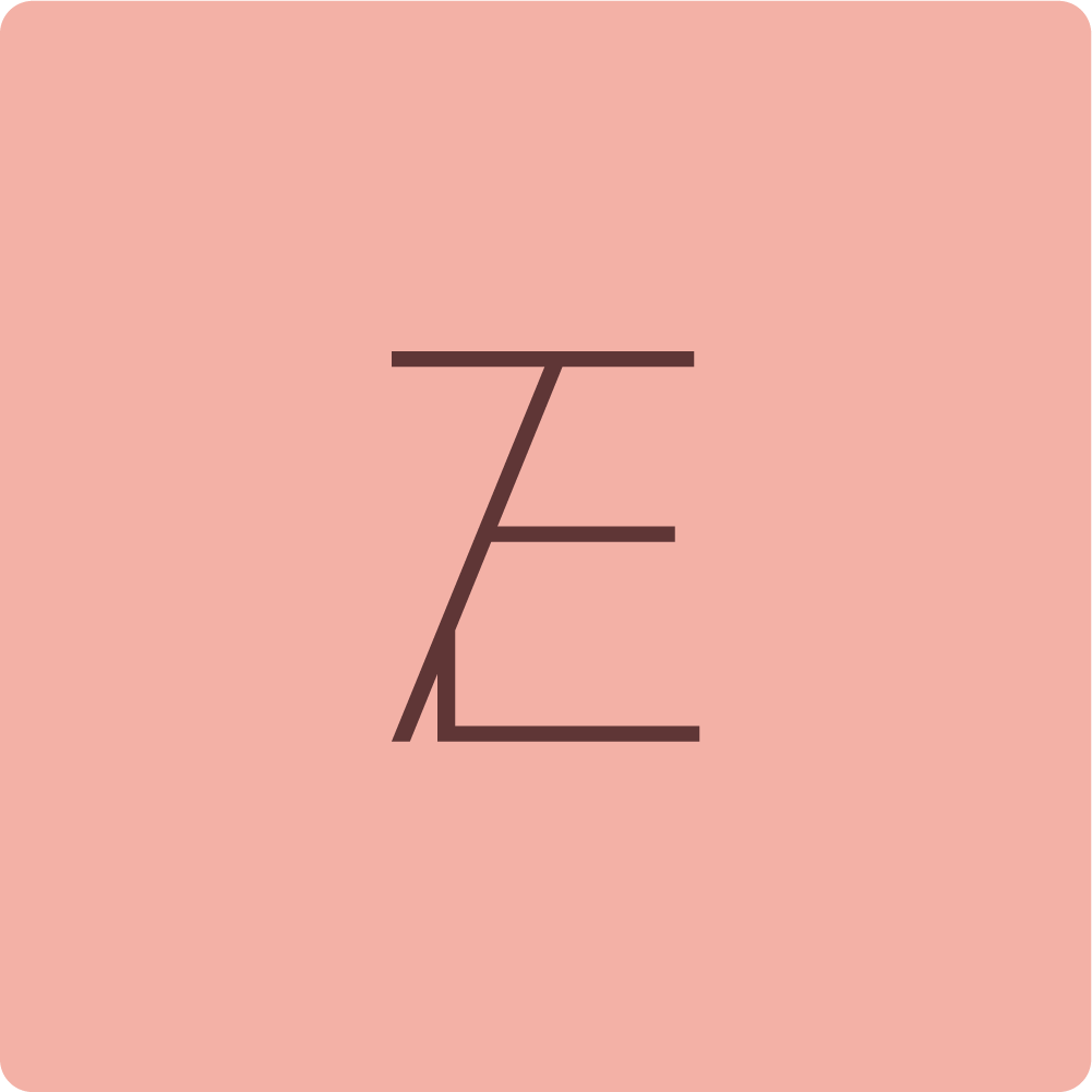
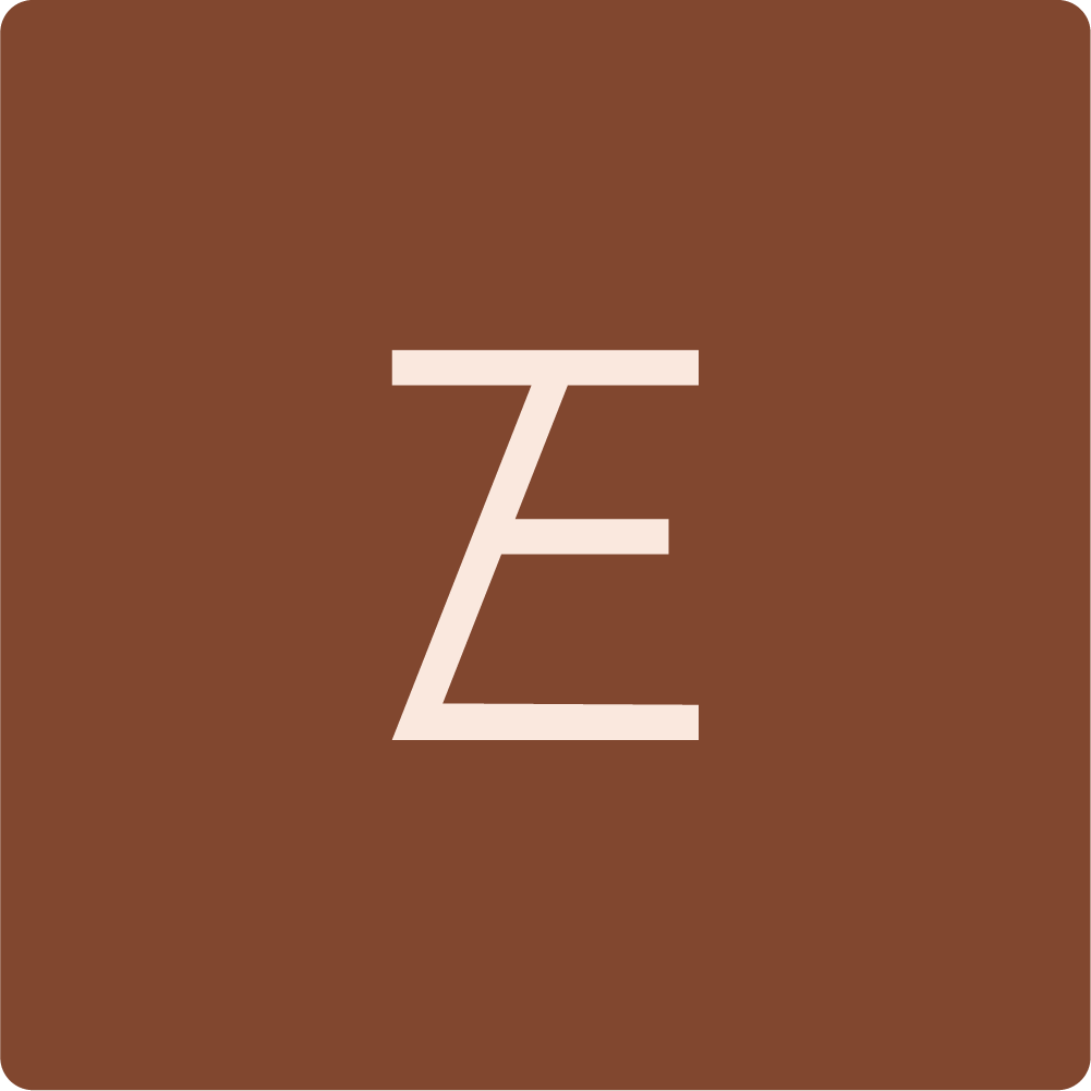
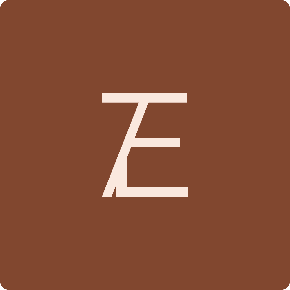
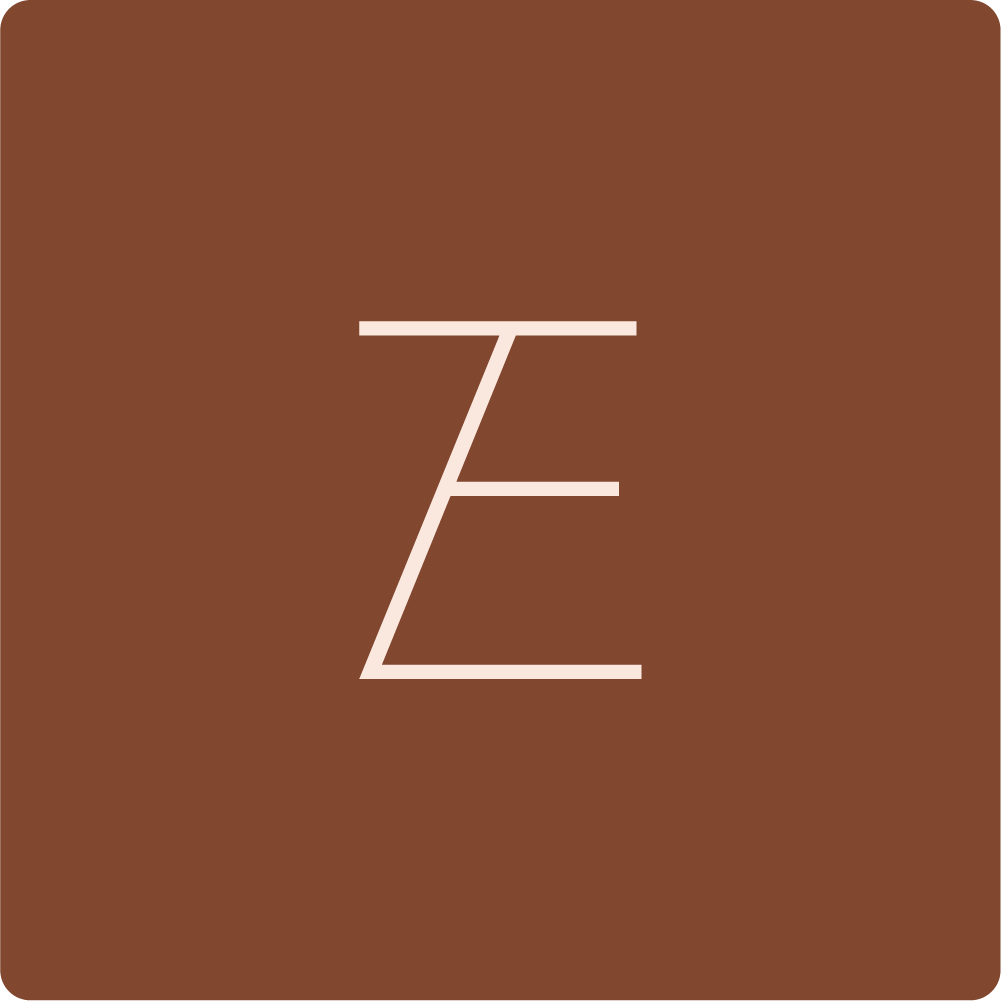
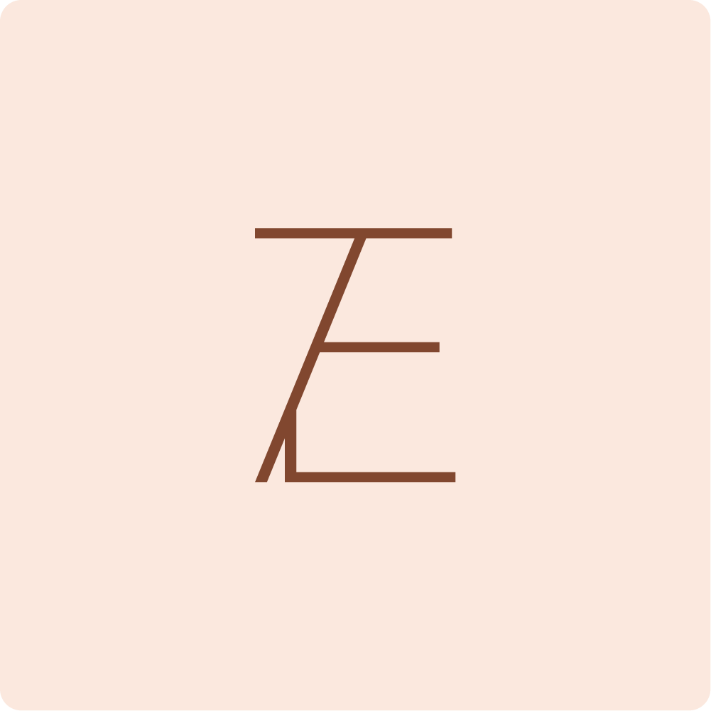
Viewing their website I only understood the logo design at a second glance: It is intended to be used in combination with tea regions e.g. Eduard/Himalaya and sections. Even on their packaging it says Eduard/Package. That made me smile.
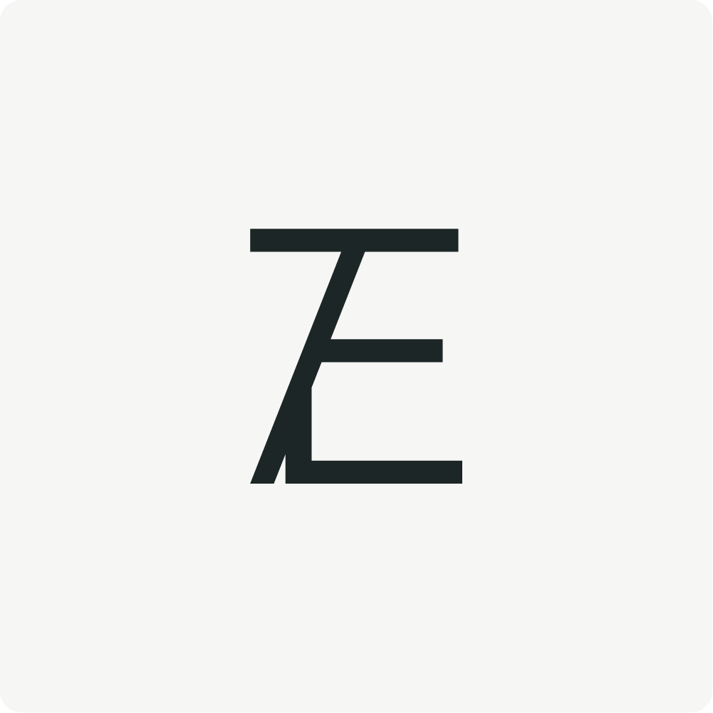
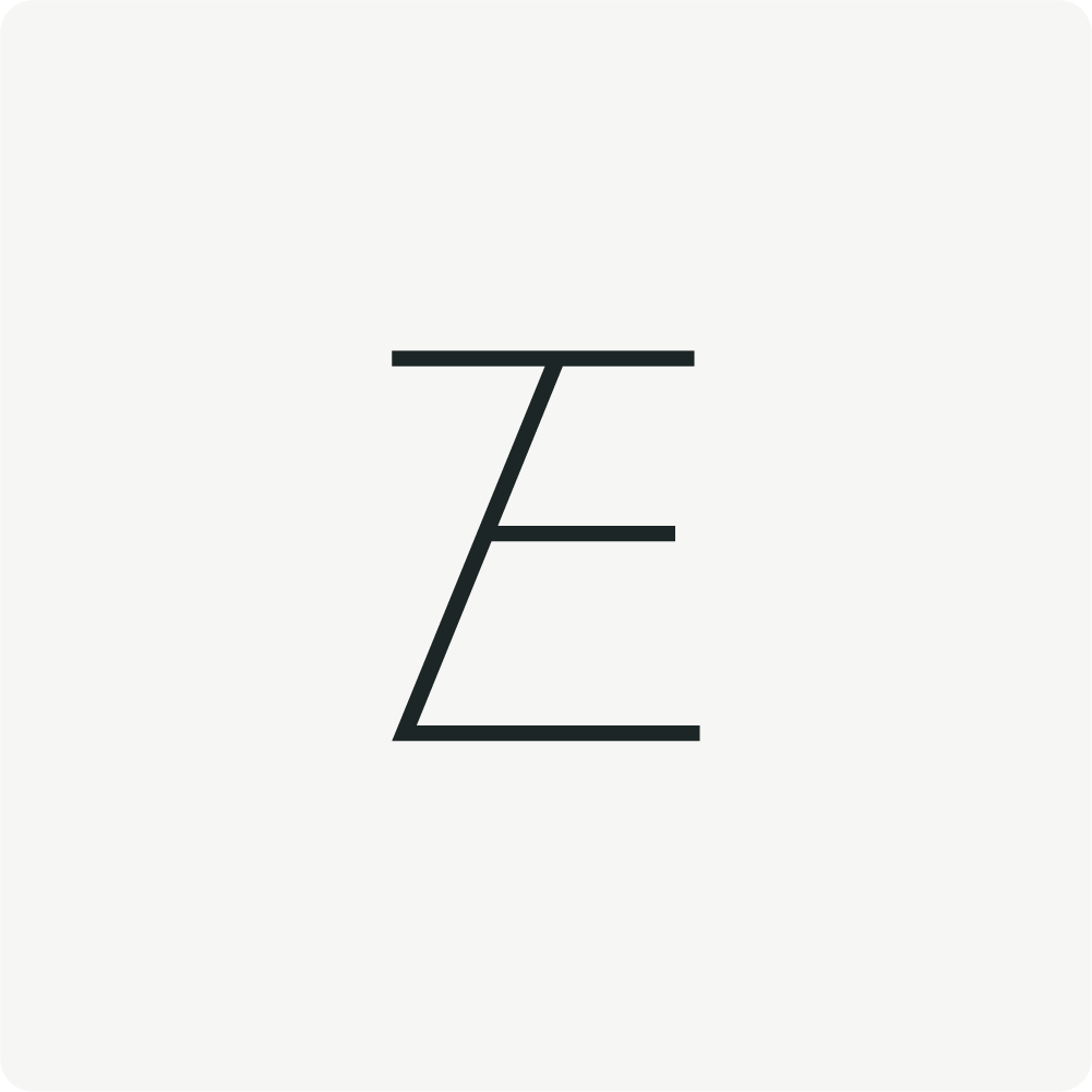
However, I wanted to explore how we can make this logo more compact, still integrating the slash: A fun side effect now is, that it phonetically reads "Te" which sounds like the German word for tea. I can imagine that this merging of the logo components can on the one hand be used when the brand is established and on the other on samples or upcoming teabags.