

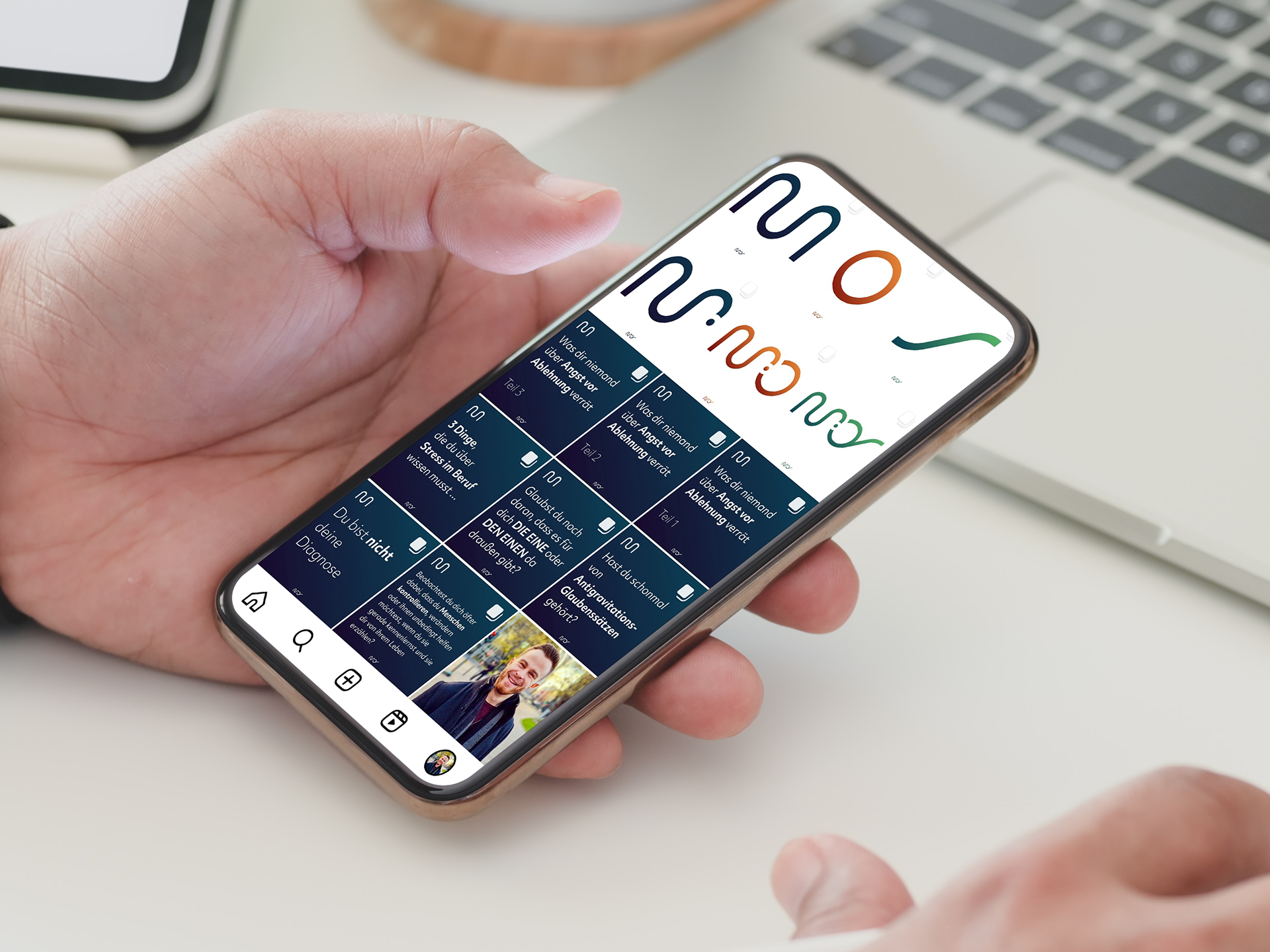
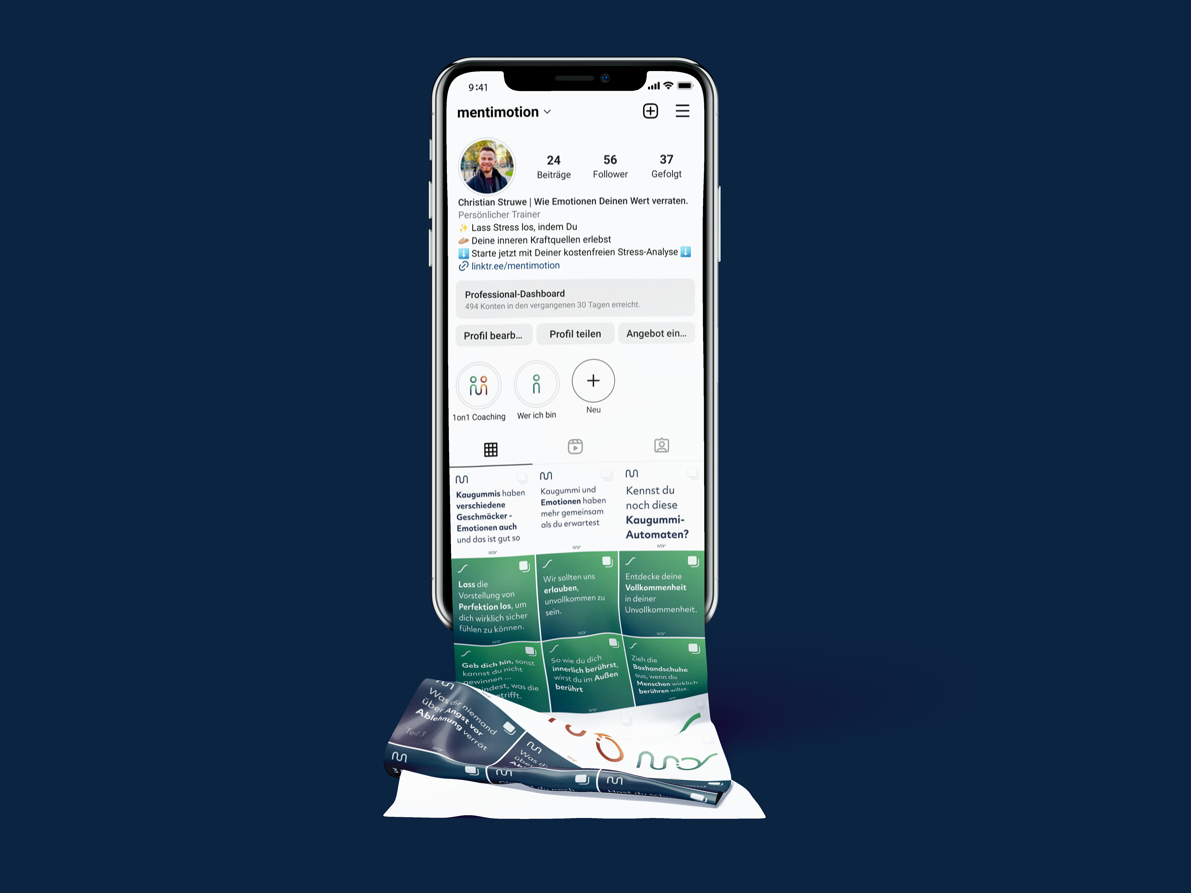
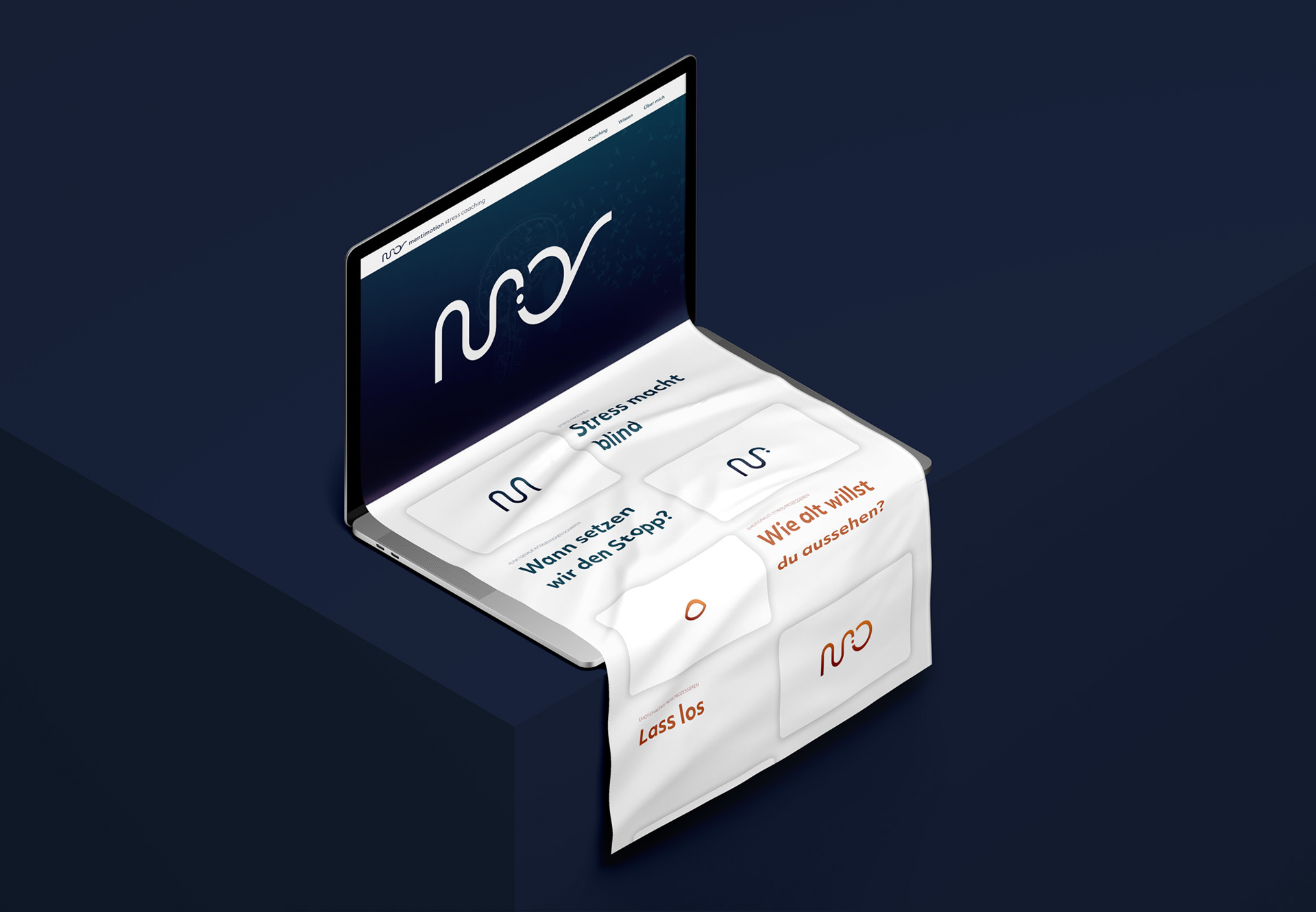
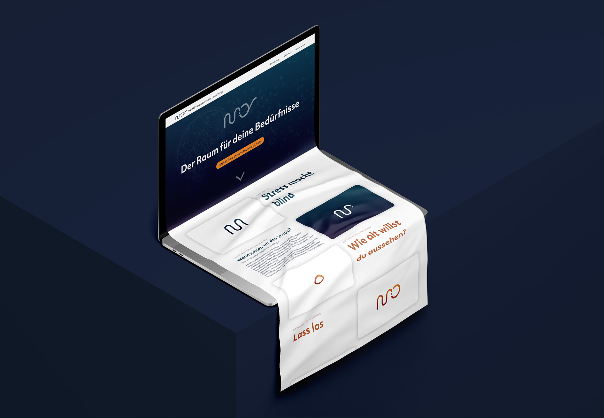
mentimotion is the brand I designed for my coaching business and as the graduation project for receiving my design diploma at hfgof_main.
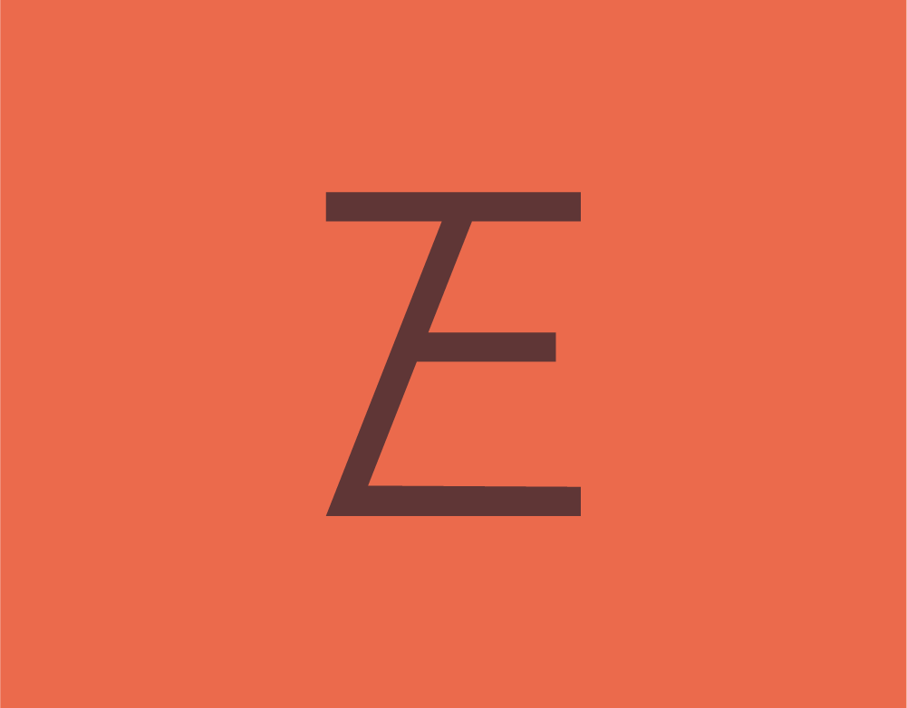
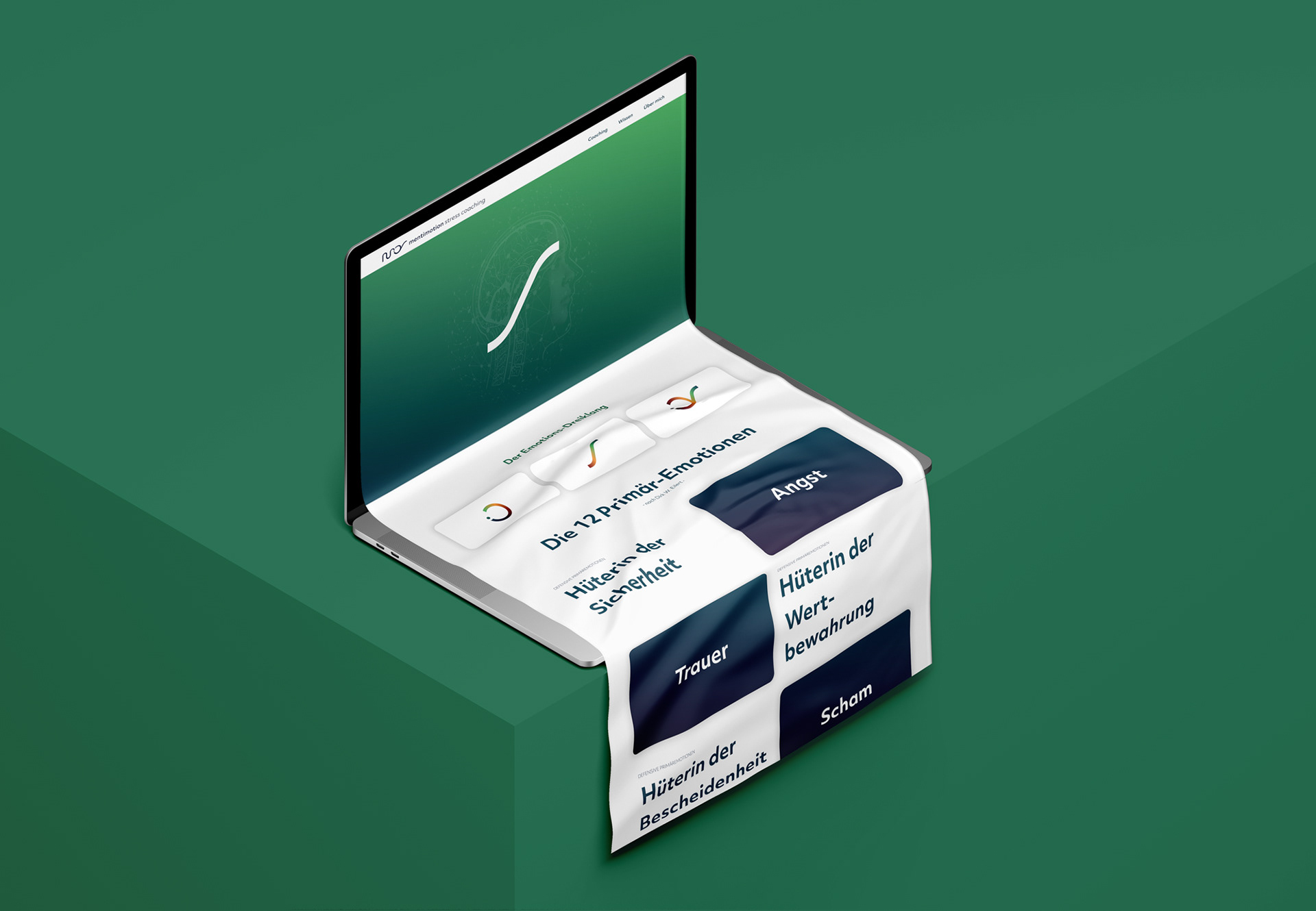
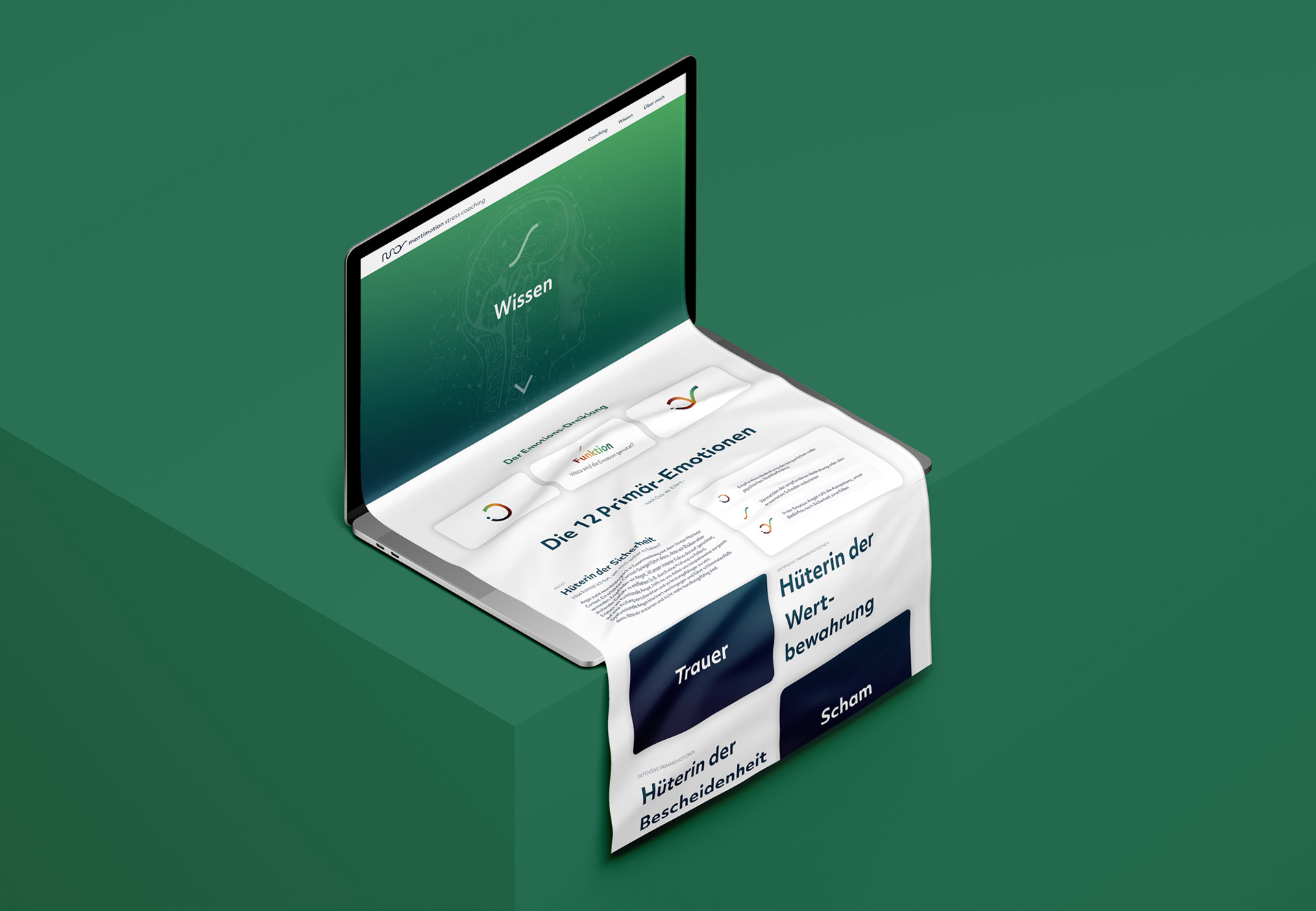
The design for mentimotion evolved around the logo which represents the process oriented and precise approach I was trained in. The various sub-components of the logo tell the story of the client journey: The up-and-down of emotions followed by the precisely selected intervention which in turn breaks the loop and is followed by leading the client into the inner resources available, thus leaving him strengethened instead of depleted (which often is the experience in coaching in therapy that does not focus on specific factors that make the approach work). This is further encoded by the use of the colors blue (understanding the problem), orange (the problem itself) and green (for the solution and resources). Colors are derived also from the compass of motives - a coaching tool which enables to map the stress and pick the correct intervention.
Currently the coaching business is not setup because I focus on my creative journey. It is interesting to discover that the less I focus on coaching and understanding people in that way, the more creative energy for design, photos and art returns. Again, it all is a matter of focus.